


I AM MARLOWE DUNN FLOM
A professional e-portfolio demonstrating my experience, professional work, academic projects, and more


My name is Marlowe Dunn Flom and I am a current student at Florida State University who is studying Public Relations and Editing, Writing, and Media. This website is a showcase of my work thus far as an aspiring public relations professional, as well as a means to communicate with me and check out some of my other achievements. Feel free to look around and explore my site!
personal statement
As a creative, committed, adaptable, and hard working individual, I will not just build upon my already present skills and experiences but also contribute as much as I can to all industries I delve into. I am able to adapt and follow with unconditional support, as well as independently lead with unique ideas. All the while, I embrace every opportunity to learn, receive feedback, and grow as an individual. One can never stop evolving and improving whether from a success or a failure, professionally or personally, and as a firm believer in this I not only will continue to grow but I will always strive for success.
SITE REFLECTION
With an e-portfolio, it is key to not only reflect upon what materials and pieces to demonstrate in the website or even which features to include into the website, it is important to also think on the aesthetics of the website and how they all reflect on their author. In my case, this e-portfolio overall is meant to convey my aspirations to become a public relations professional and the work and experience I have done thus far that best reflect my steps in reaching closer to that goal. Furthermore, the e-portfolio itself and its contents are meant to also serve as an overview of my qualifications for any public relations related job as of now and essentially as an extension of my resume. With this in mind, my e-portfolio is also meant to appeal to and be primarily viewed by potential employers and other peers aspiring to enter the public relations arena. In this way, the materials I have chosen appeal to the visual and stylistic conventions of this respected field of work, as well as my own personal preferences, in addition to the features I have included in my e-portfolio.
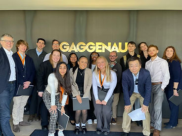
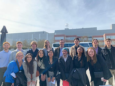
From the very pages I have decided to include in the website and its contents therein, there is an intention behind them to keep this site as professional as possible with less of an emphasis on me, the author, and more on my work. Hence, there are only 4 pages to access on this site: the home page, the projects page, the resume page, and the contact page. On the home page, there is a title portion naming the website and its author, with one brief introduction to the site and what it contains, after which are some photos of some of my various professional activities alongside a few headshots of myself, and then at the end of the home page is a lengthier description of this website and its purpose, followed by a personal statement, and after which is this reflection. All of this is meant to introduce the viewer to my website and in a concise way explain this website and moreover introduce the viewer to me, the author. This is done in a visual way with the photos, putting a face to a name, and then via my voice in the various descriptions I give on this homepage for my website and this reflection which is meant to, again, provide explanation for this website alongside some insight into my own desires for this website and the kind of experience I want to afford to its viewers and why. Concisely introducing the website and its creator is appropriate for a homepage in general but particularly in this industry and when I have other pages on the side dedicated to explaining myself and my work further.
The projects page, for instance, contains five of the most recent and exemplary works I have pertaining to more professional, academic, and even journalistic writing that is relevant to the PR field. These works are ones I have submitted for various PR affiliated activities and even internships to varying success. Alongside links to these works linked in through the photos, which is a convention and fun interactive feature as well as a visually engaging one I have noticed on several different websites, there are brief descriptions of the works. These are meant to peak the viewers' interests in the works and their accompanying pictures as well as both functioning to provide some summary of the works for the viewers’ convenience. There is also at the top of the page an explanation of these works and their relevance to me and the site alongside an offer to contact me with any questions about the works or for further samples of my writing, as again, this is a sampling of some of my more recent and best work. The next page, the resume page, contains my digital resume and serves as a way to provide further contextualization to my experiences and qualifications.
The resume page is very straightforward and serves to display my more stylistic and redesigned resume that is more visually captivating than a more traditional black and white, traditional resume. Additionally, alongside some of my sample works and the site itself, this digital resume is meant to convey my design skills and my own design preferences. Including my favorite color, purple, and my love of more serif type font and its more forma, elegant, traditional connotations that I hope to exude. I will explain more later on when I discuss the site’s design elements. It also contains a photo of myself to, again, provide a face to a name/ work and the curricular shapes meant to contain various sections of the resume is meant to look softer against the more rigid and formal serif font while also being visually compelling and drawing the eye to different sections, as well as separating text into different sections visually. In this way, much of the design of the resume and the page itself are as straightforward as the contact page of the e-portfolio.
The contact page is merely meant to have a go-to page for my contact information as well as a means to send me a message directly via the website, in case the viewer does not want to or did not notice my contact information available in summary at the bottom of each page. The contact page also informs the viewer what are the most efficient ways to contact me, lists all of the means I am available to be contacted at and at their and my own convenience alongside the website’s means of reaching out to me. The purpose of this page is, again, to provide a devoted and easy to find section to immediately find my contact information rather than scroll to the bottom of one of the other pages, even though in the design of each page this contact information is provided.
This leads into the design of the site as a whole and how it is both meant to reflect my own tastes, as well as the aesthetic standards of most PR e-portfolio websites. This includes a rather minimalist design with some visual flair with more straightforward, concise, and direct descriptions on each page of its contents as well as the pages/ site features themselves. One reason behind this and by extension my own design choices is to make the website easily navigable and let the reader know exactly where to find certain information. This extends into the decision to have the page menu bar fade away as the viewer scrolls down a page but appear again as the mouse moves or is in a certain active position of the page. Another example is the contact information provided in summary at the bottom of each page of the site, a convention on almost all professional websites across all industries and all meant to make it easy for the viewer to contact the website and its author upon reading a page and wanting more information afterward. The interlocked circles at the top of the home bar are just a simple but visually striking motif that I thought seemed elegant and intriguing, as well as a design I simply liked and had some flare to it that I thought was somewhat reflective of me. Another indication of my own tastes and preferences, is my choice in font throughout the site, which is mix of different serif fonts that, as mentioned earlier, give off a classic and established impression. They are evocative of certain publications such as Vogue or The New York Times which have heavy ties to the PR field but also evoke an impression of elegance and refinement that I hope to evoke with my own work and professional persona. The simple color scheme of dusty blues, grays, whites, and blacks are meant to be simple and conventional but still professional and elegant. They also make the more colorful elements stand out and capture the viewers’ attention, particularly with those dusty blues and the standout moving background of the website, done in a dusty blue-green color. This really captures the viewers’ attention and stands out from more static and conventional e-portfolios and gives my own its own special flare. It may even be evocative of my own subtle yet noticeable style and ability to be forward thinking, current, and engaging as well as engaged, similar to the contemporary nature of the moving background and its color against these more traditional elements. This e-portfolio represents my ability to balance both the traditional and elegant with the cutting edge and contemporary seamlessly, indicative in both my projects and resume and the very design of this website as a whole.